source code
The complete source code for this article can be found in this gist.
Django Admin is a powerful tool for managing data in your app. However, it was not designed with summary tables and charts in mind. Luckily, the developers of Django Admin made it easy for us to customize.
This is what it's going to look like at the end:

Why Would I Want To Do That
There are a lot of tools, apps and packages out there that can produce very nice looking dashboards. I personally found that unless the product is an actual dashboard, most of the time all you need is a simple summary table and a few charts.
Second, and just as important - no dependencies.
If all you need is a little boost to your admin interface this approach is definitely worth considering.
Setup
We are going to use a made up Sale model.
To harness the full power of Django Admin we are going to base our dashboard on a the built-in ModelAdmin.
To do that we need a model:
# models.py

class SaleSummary(Sale):
    class Meta:
        proxy = True
        verbose_name = 'Sale Summary'
        verbose_name_plural = 'Sales Summary'
A proxy model extends the functionality of another model without creating an actual table in the database.
Now that we have a model we can create the ModelAdmin:
# admin.py

from django.contrib import admin
from .models import SaleSummary

@admin.register(SaleSummary)
class SaleSummaryAdmin(ModelAdmin):
    change_list_template = 'admin/sale_summary_change_list.html'
    date_hierarchy = 'created'
Because we are using a standard ModelAdmin we can use its features. In this example I added a date_hierarchy to filter sales by creation date. We are going to use this later for the chart.
To keep the page looking like a "regular" admin page we extend Django's change_list template and place our content in the result_list block:
<!-- sales/templates/admin/sale_summary_change_list.html -->

{% extends "admin/change_list.html" %}

{% block content_title %}
    <h1> Sales Summary </h1>
{% endblock %}

{% block result_list %}
    <!-- Our content goes here... -->
{% endblock %}

{% block pagination %}{% endblock %}
This is what our page looks like at this point:

Adding a Summary Table
The context sent to the template is populated by the ModelAdmin in a function called changelist_view.
To render the table in the template we fetch the data in changelist_view and add it to the context:
# admin.py

class SaleSummaryAdmin(ModelAdmin):

    # ...

    def changelist_view(self, request, extra_context=None):
        response = super().changelist_view(
            request,
            extra_context=extra_context,
        )

        try:
            qs = response.context_data['cl'].queryset
        except (AttributeError, KeyError):
            return response

        metrics = {
            'total': Count('id'),
            'total_sales': Sum('price'),
        }

        response.context_data['summary'] = list(
            qs
            .values('sale__category__name')
            .annotate(**metrics)
            .order_by('-total_sales')
        )

        return response
Let's break it down:
- Call super to let Django do its thing (populate headers, breadcrumbs, queryset, filters and so on).
- Extract the queryset created for us from the context. At this point the query is filtered with any inline filters or date hierarchy selected by the user.
- If we can't fetch the queryset from the context it's most likely due to invalid query parameters. In cases like this Django will redirect so we don't interfere and return the response.
- Aggregate total sales by category and return a list (the "metrics" dict will become clear in the next section).
Now that we have the data in the context we can render it in the template:
<!-- sale_summary_change_list.html -->

{% load humanize %}

<!-- ... -->

{% block result_list %}

<div class="results">
    <table>

    <thead>
      <tr>
        <th>
          <div class="text">
            <a href="#">Category</a>
          </div>
        </th>
        <th>
          <div class="text">
            <a href="#">Total</a>
          </div>
        </th>
        <th>
          <div class="text">
            <a href="#">Total Sales</a>
          </div>
        </th>
        <th>
          <div class="text">
            <a href="#">
              <strong>% Of Total Sales</strong>
            </a>
          </div>
        </th>
      </tr>
    </thead>

    <tbody>
      {% for row in summary %}
      <tr class="{% cycle 'row1' 'row2' %}">
        <td> {{ row.sale__category__name }} </td>
        <td> {{ row.total | intcomma }} </td>
        <td> {{ row.total_sales | default:0 | intcomma }}$ </td>
        <td>
          <strong>
          {{ row.total_sales |
              default:0 |
              percentof:summary_total.total_sales }}
          </strong>
        </td>
      </tr>
      {% endfor %}
    </tbody>

  </table>
</div>

<!-- ... -->

{% endblock %}
The markup is important. To get the native Django look we need to render tables in the same way Django renders them.
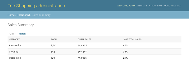
This is what we have so far:
A summary table is not much without a bottom line. We can use the metrics and do some Django ORM voodoo to quickly calculate the bottom line:
# admin.py

class SaleSummaryAdmin(ModelAdmin):
    # ...
    def changelist_view(self, request, extra_context=None):
        # ...
        response.context_data['summary_total'] = dict(
            qs.aggregate(**metrics)
        )
        return response
That's a pretty cool trick…
Lets add the bottom line to the table:
<!-- sale_summary_change_list.html -->

<div class="results">
    <table>

        <!-- ... -->

        <tr style="font-weight:bold; border-top:2px solid #DDDDDD;">
            <td> Total </td>
            <td> {{ summary_total.total | intcomma }} </td>
            <td> {{ summary_total.total_sales | default:0 }}$ </td>
            <td> 100% </td>
        </tr>

    </table>
</div>
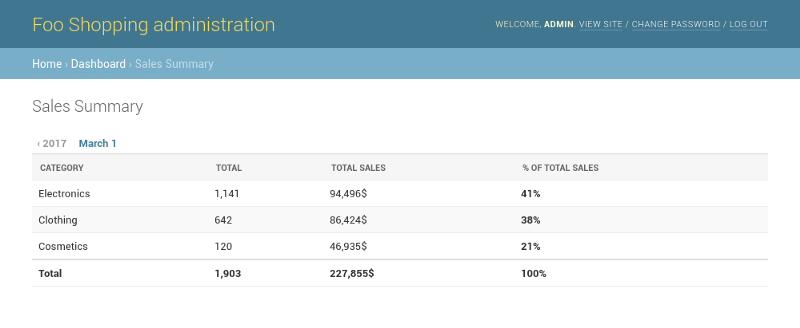
This is starting to take shape:
Adding Filters
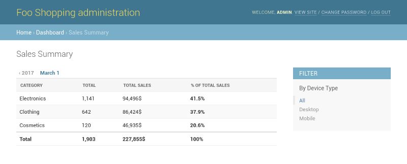
We are using a "regular" model admin so filters are already baked in. Let's add a filter by device:
# admin.py

class SaleSummaryAdmin(ModelAdmin):

    # ...

    list_filter = (
        'device',
    )
And the result:
Adding a Chart
A dashboard is not complete without a chart so we are going to add a bar chart to show sales over time.
To build our chart we are going to use plain HTML and some good ol' CSS with flexbox. The data for the chart is going to be a time series of percents to use as the bar height.
Back to our changelist_view, we add the following:
# admin.py

from django.db.models.functions import Trunc
from django.db.models import DateTimeField

class SalesSummaryAdmin(ModelAdmin):

    # ...

    def changelist_view(self, request, extra_context=None):

        # ...

        summary_over_time = qs.annotate(
            period=Trunc(
                'created',
                'day',
                output_field=DateTimeField(),
            ),
        ).values('period')
        .annotate(total=Sum('price'))
        .order_by('period')

        summary_range = summary_over_time.aggregate(
            low=Min('total'),
            high=Max('total'),
        )
        high = summary_range.get('high', 0)
        low = summary_range.get('low', 0)

        response.context_data['summary_over_time'] = [{
            'period': x['period'],
            'total': x['total'] or 0,
            'pct': \
               ((x['total'] or 0) - low) / (high - low) * 100
               if high > low else 0,
        } for x in summary_over_time]

    return response
Let's add the bar chart to the template and style it a bit:
<!-- sale_summary_change_list.html -->

<div class="results">

    <!-- ... -->

    <h2> Sales over time </h2>

    <style>
    .bar-chart {
      display: flex;
      justify-content: space-around;
      height: 160px;
      padding-top: 60px;
      overflow: hidden;
    }
    .bar-chart .bar {
        flex: 100%;
        align-self: flex-end;
        margin-right: 2px;
        position: relative;
        background-color: #79aec8;
    }
    .bar-chart .bar:last-child {
        margin: 0;
    }
    .bar-chart .bar:hover {
        background-color: #417690;
    }

    .bar-chart .bar .bar-tooltip {
        position: relative;
        z-index: 999;
    }
    .bar-chart .bar .bar-tooltip {
        position: absolute;
        top: -60px;
        left: 50%;
        transform: translateX(-50%);
        text-align: center;
        font-weight: bold;
        opacity: 0;
    }
    .bar-chart .bar:hover .bar-tooltip {
        opacity: 1;
    }
    </style>

    <div class="results">
        <div class="bar-chart">
        {% for x in summary_over_time %}
            <div class="bar" style="height:{{x.pct}}%">
                <div class="bar-tooltip">
                    {{x.total | default:0 | intcomma }}<br>
                    {{x.period | date:"d/m/Y"}}
                </div>
            </div>
        {% endfor %}
        </div>
    </div>

</div>
For those of you not familiar with flexbox, that piece of CSS means "draw from the bottom up, pull to the left and adjust the width to fit".
This is how it looks like now:
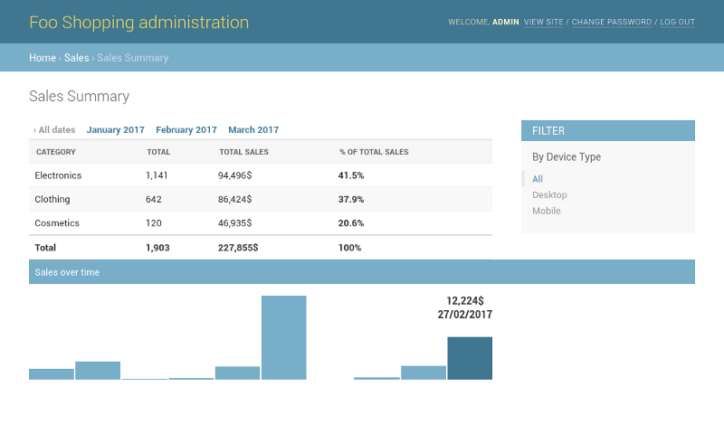
That's looking pretty good, but... Each bar in the chart represents a day. What will happen when we try to show data for a single day? Or several years?

A chart like that is both unreadable and dangerous. Fetching so much data will flood the server and generate a huge HTML file.
Django Admin has a date hierarchy - let's see if we can use that to adjust the period of the bars based on the selected date hierarchy:
def get_next_in_date_hierarchy(request, date_hierarchy):
    if date_hierarchy + '__day' in request.GET:
        return 'hour'

    if date_hierarchy + '__month' in request.GET:
        return 'day'

    if date_hierarchy + '__year' in request.GET:
        return 'week'

    return 'month'
- If the user filtered a single day each bar will be one hour (max 24 bars).
- If the user selected a month each bar will be one day (max 31 bars).
- If the user selected a year each bar will be one week (max 52 bars).
- More than that and each bar will be one month.
Now we need just one small adjustment to the change list view:
# admin.py

class SalesSummaryAdmin(ModelAdmin):

    # ...

    def changelist_view(self, request, extra_context=None):

        # ...

        period = get_next_in_date_hierarchy(request, self.date_hierarchy)
        response.context_data['period'] = period

        summary_over_time = qs.annotate(
            period=Trunc('created', period, output_field=DateTimeField()),
        ).values('period')
        .annotate(total=Sum('price'))
        .order_by('period')

        # ...
The period argument passed to Trunc is now a parameter. The result:
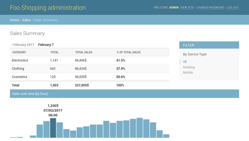
That's a beautiful trend...
Where Can We Take It From Here?
Now that you have all this spare time from not rolling your own dashboard you can:
